How ordering information hierarchy can make or break an interface experience
The Hierarchical Powers That Be
When I think of hierarchy, a power struggle comes to mind. Something straight out of a medieval times throne-grabbing Game of Thrones-esque story. Every pawn and piece is at play competing for a chance at the top of the stack, at all costs.
Sure, I’m talking in reference to user interface design, and yes this framing might sound a bit lofty, but stick with me. When it comes to designing interfaces it’s worth while to consider that every intention and decision in a layout of elements is a power-grabbing battle for attention. There’s only room enough for one queen bee in this game…er…um…interface.
The Task of Hierarchy
We recently updated the interface for the Joy app, updated typography, colors, and some layout. These changes were mostly for a visual brand update, but we use the layout improvements was to improve the usability hierarchy.
Really quick, I just wanted to pause and say that thinking about hierarchy gets me nostalgic. These ideas tap right into my formal design education; where the hierarchical task is the basic endgame of the classic design principles. We employ color, weight, contrast, scale, movement, etc. to accentuate this hierarchy (or lack thereof). Designing posters, print layout, video storyboards, environmental spaces, ad units, and just about any functional form employs hierarchy.
Get Squinty
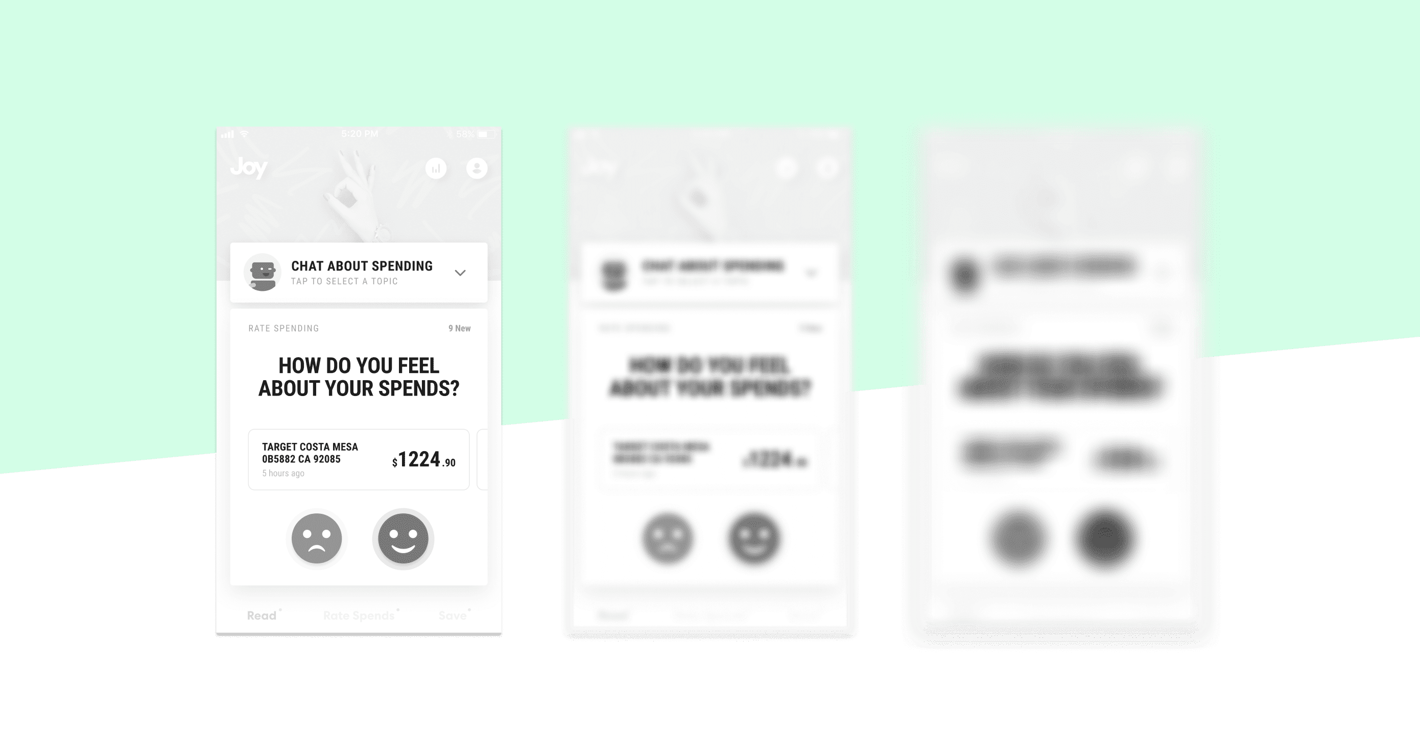
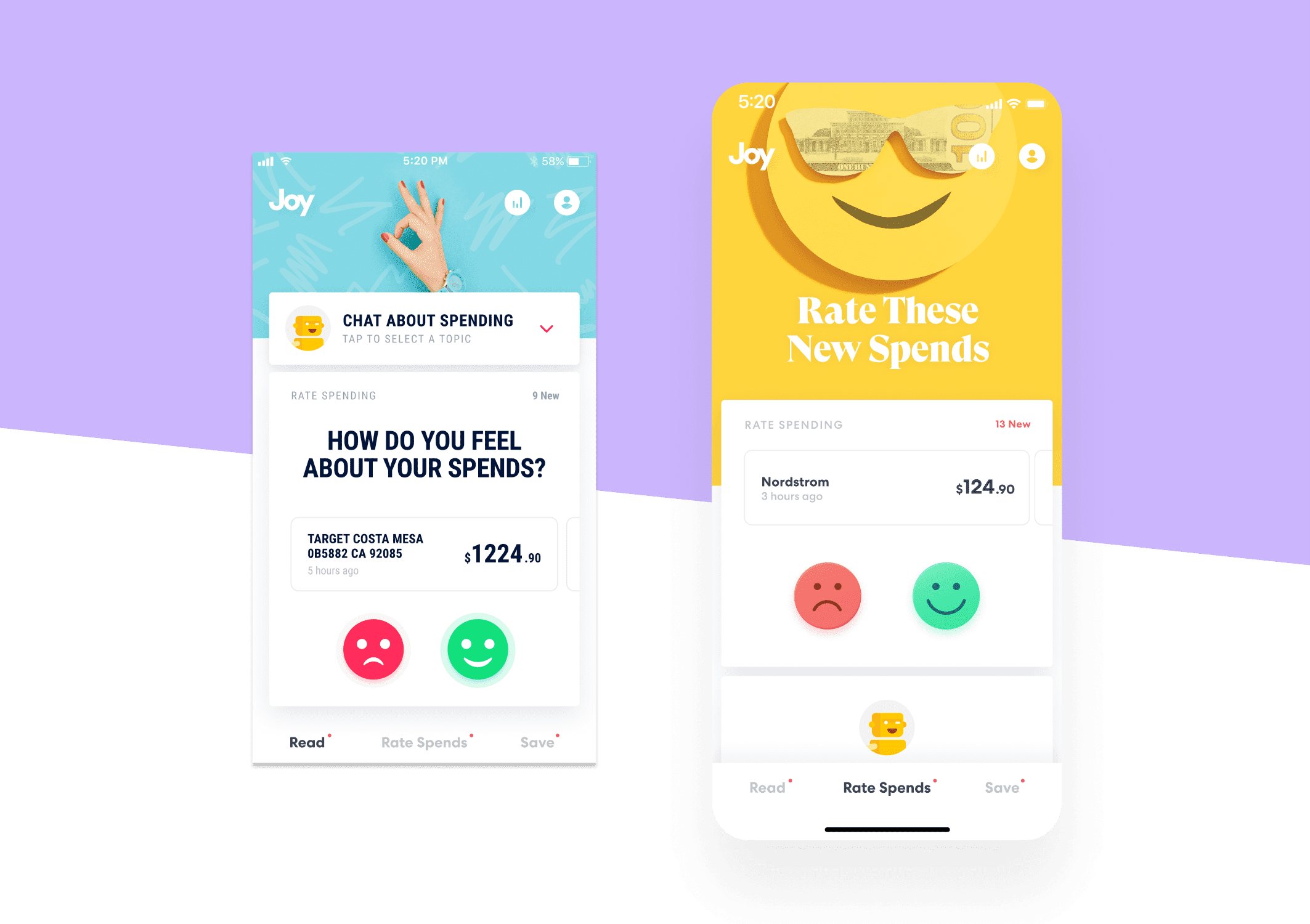
Back to my task at hand. As an anecdote, take a look at these original screens in Joy to get a picture of where I was starting.

I completely desaturated and progressively blur the image to simulate the squinting and blurring of the eyes. This is a little trick that I do when working to spot areas in the screen that are fighting for that hierarchical throne. I squint A. LOT. when I’m designing (especially kerning), it helps give me the ability to sense the heavy areas of a particular design. In this given instance I count about 4–6 elements that are battling it for the queen spot.
The issue with the original interface is that your eye bounces around in circles looking for a resting place. It’s in these resting places that we find our queen hierarchical element(s).
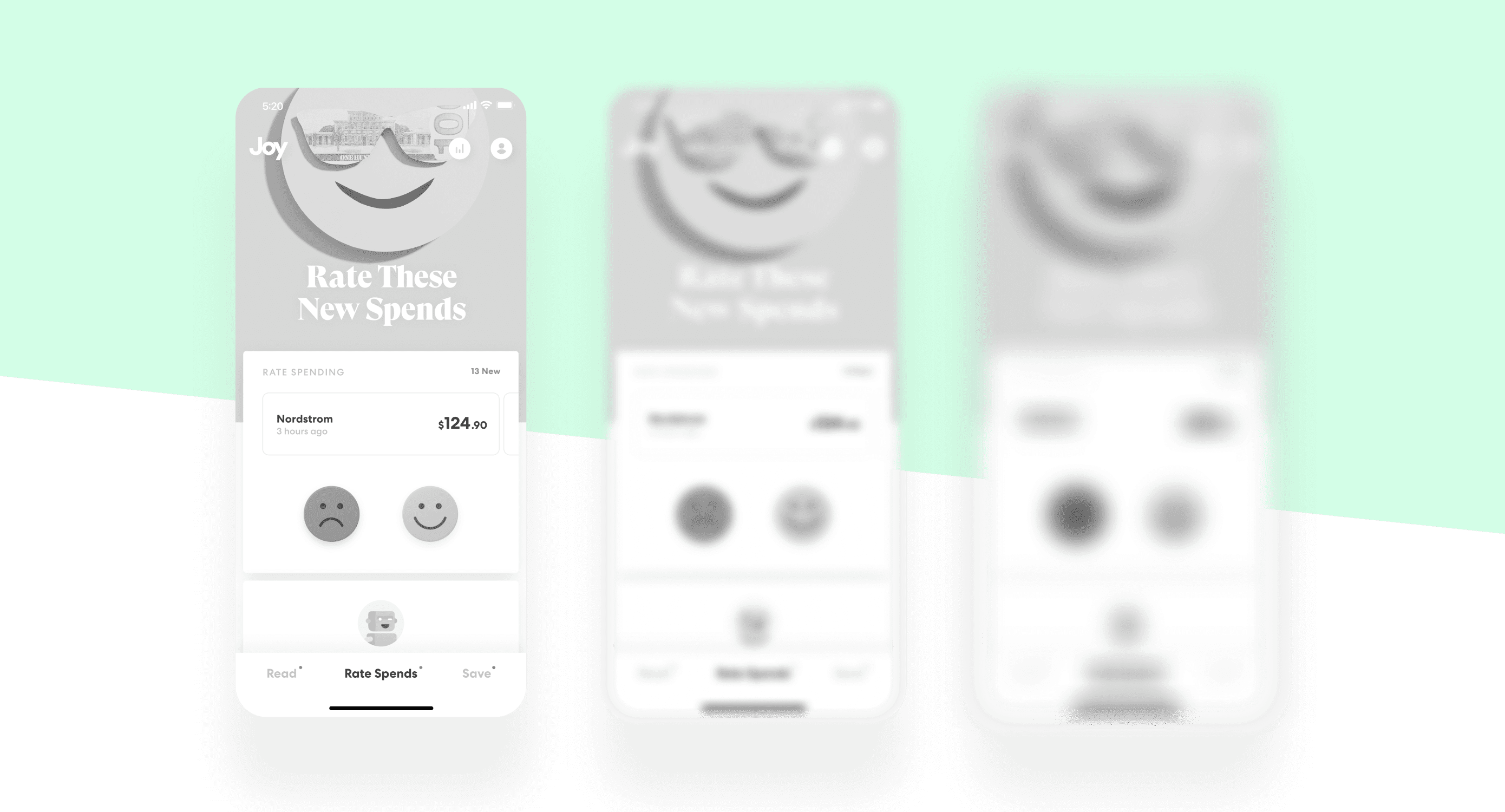
As this exercise has simulated, I’m able to clearly diagnose this issue we’re having and tangibly solve for them. Here is where we landed for the final design of the spend rating screen.

There was a choice to soften the lesser important areas and add/maintain weight for my target resting area. In this case that area lies in the primary action (the happy/sad buttons). Taking the text and resting it in the header image helped soften the dominance while maintaining visibility. We also flipped the vertical order of the chat conversation starters and ditched the open/close mechanism.

In the simulation of eye blurring, you can see elements don’t blare through with the same harsh dominance as the it’s predecessor. The eye can rest and no longer spin looking as it looks for that hierarchical queen space.
Just to be clear, I don’t think the idea the hierarchy existing in a user interface is a novel idea. For me it’s a powerful reminder to evaluate whole interfaces and screens with this method. It’s our mission as a product team to always improve the work we put out into the world. Products are never done. Additionally, for those who don’t have a formal design background I hope it’s a new and useful exercise.
Thanks for reading!
--
** This article was originally published on the Happy Design Team publication, you can read that here. **
